



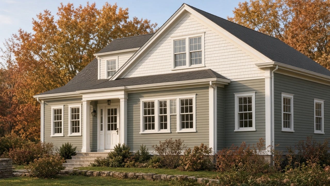
TL;DR: Two-tone works on New England homes when the split follows the architecture rather than fighting it: darker body below, lighter shingle or gable above, or a contrasting first-floor material. Keep it to two body colors plus trim, not three. On vinyl, both tones still have to respect the LRV 55 floor, or use a vinyl-safe line. The most reliable combination here remains a muted body, a lighter secondary, and crisp white trim tying them together.
Thinking about splitting the elevation? Call or text Dave at (774) 217-9567. We will sample both tones on the actual wall before anyone commits.
Two-tone exteriors have moved from builder-grade novelty to a mainstream choice, and New England housing stock is unusually well suited to it because so much of it already has a natural break: a shingled gable over clapboard, a gambrel, a shed dormer, a porch band.
Where should the color change happen?
The rule that keeps two-tone from looking arbitrary: split where the building already changes. Do not invent a line.
- Gable above, body below. The most common and most reliable on colonials and Capes. Lighter tone up, heavier tone down, which reads as grounded.
- Material change. Shingle over clapboard, or a first-floor band of a different profile. The color follows the material, which is why it never looks forced.
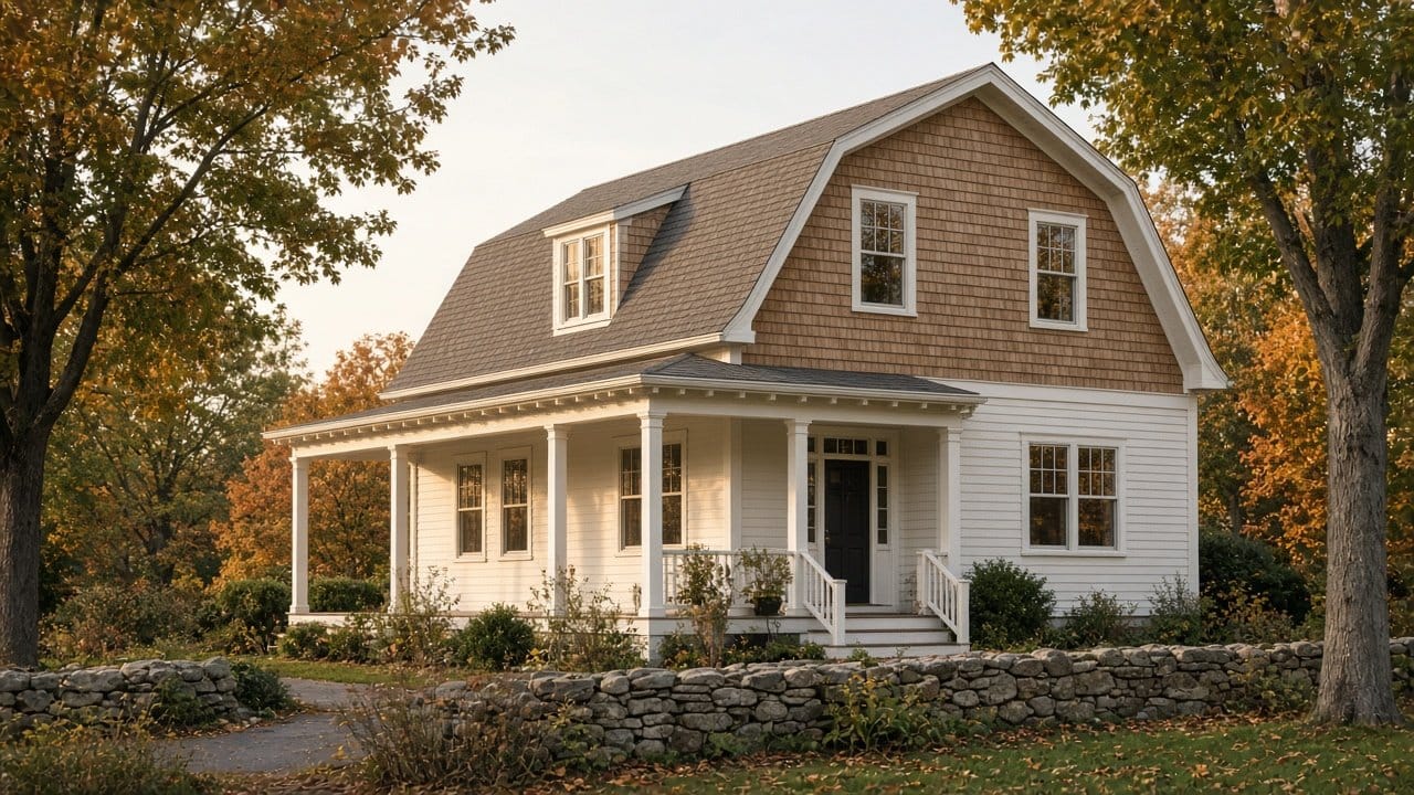
- Gambrel upper. The roofline does the work already. A second tone on the upper slope is close to traditional.
- Porch and skirt. A darker skirt or foundation band under a lighter body, especially on raised Capes.
- Dormers. Treating dormers as the secondary color, tying them to the trim rather than the body.
What does not work is a horizontal line drawn across an unbroken wall at an arbitrary height. It reads as unfinished, and on a resale walkthrough it reads as a mistake.
Combinations that hold up here
Pairings we see work repeatedly on MetroWest stock:
- Warm white body with a muted blue-gray gable. Traditional, low risk, strong in listing photos.
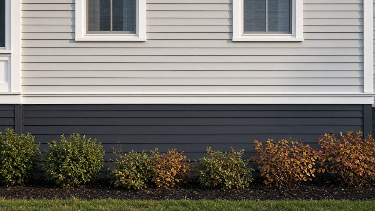
- Soft gray body with a deeper charcoal skirt or porch band. Contemporary without leaving the regional vocabulary.
- Sage or muted green body with a warm white upper. Suits wooded lots and older houses particularly well.
- Greige body with a natural cedar-toned shingle upper. The stained-shingle contrast rather than a painted second color, which ages differently and often better.
- Navy lower with white upper and white trim. High contrast, high appeal, and the one most likely to hit the LRV problem below.
Keep the count honest. Two body tones plus trim is a scheme. Three body tones plus trim plus an accent door is usually a house that will be repainted by the next owner.
The constraint that applies to both tones
On vinyl, the light reflectance limit applies to every color on the wall, not just the main one. Darker colors absorb more solar energy and vinyl has a low heat distortion temperature, so the secondary tone can warp a section just as readily as a full-house dark could.
Benjamin Moore's exterior data sheets set the floor at a Light Reflectance Value of 55, and add that the color must also not be darker than the original siding, unless it comes from their approved Colors for Vinyl palette. The wording is in the Regal Select Exterior technical data sheet. Sherwin-Williams sets 56 in its 09 91 13 exterior specification unless VinylSafe colors are used.
This is exactly why the darker tone usually belongs on the smaller area. A charcoal skirt band is a modest amount of wall. A charcoal full body on a south elevation is a different proposition. If you want the dark tone anyway, VinylSafe and Colors for Vinyl use infrared-reflective pigments to make it workable. How those hold up over time is in fade-resistant siding colors.
Trim is the third element, and it is not optional
A two-tone scheme without a unifying trim color reads as two houses. Trim is what makes the split deliberate. In practice that means a single crisp trim color carried across windows, corner boards, rakes and the porch, regardless of which body tone it is sitting against.
White is the default here for good reason and it is the safest resale choice, covered in siding colors and resale value. The alternative that works is trim matched to the lighter body tone, which produces a quieter, more monochrome result. What rarely works is a third trim color introduced as an accent.
Shutters and the front door are where a genuine accent belongs, because they are small, replaceable and easy to change your mind about. That is in repainting the front door and shutters.
Test it on the wall, not on a chip
Two-tone fails more often from a bad relationship between the tones than from a bad individual color. Two colors that look balanced on a fan deck can read as a mismatch at full scale under October light on a north elevation.
We sample both tones on the actual wall, adjacent, at the actual split line, and look at them at three times of day. The pairing changes noticeably between morning and late afternoon, and it is worth an extra day to find that out before a crew is on site.
The same logic applies to matching an existing element you are not changing, a stone foundation, a roof color, or a fixed brick chimney. Those are inputs, not afterthoughts, and brick in particular narrows the palette hard, as in limewash and German smear on brick.
Does two-tone cost more?
Somewhat, and the increase is labor rather than material. A single-color exterior repaint on sound siding runs roughly $2.81 to $5.14 per square foot in Massachusetts. A two-tone scheme adds cut-in time at the split line, an extra set of masking, and a second product to stage and keep straight on site. On most MetroWest colonials that is a modest percentage on top rather than a different order of cost.
Where it stops being modest is a scheme with three body tones and multiple accents, which multiplies the cut lines. The base numbers are in what it costs to paint faded siding and the Massachusetts house painting cost guide. Our work carries a 2-year warranty either way.
One caution on older and historic homes
If the house sits in a local historic district, the color scheme may not be entirely yours to choose, and a two-tone split is exactly the kind of change that draws a review. Check before you plan, not after, in historic district paint approval in Massachusetts.
On older stock outside a district, the argument for two-tone is usually strongest, because the architecture already provides the break and the historical precedent exists. A gambrel or a shingle-style house was often finished in two materials from the start.
Frequently asked questions
What are the best two-tone siding color combinations for New England homes?
Warm white with a muted blue-gray gable, soft gray with a charcoal skirt, and sage with a warm white upper are the most reliable pairings on regional housing stock, always with crisp trim.
Where should the color change on a two-tone house?
At a point the architecture already defines: a material change, a gable, a gambrel slope, a porch band or dormers. An arbitrary horizontal line across an unbroken wall reads as unfinished.
Can you do two-tone on vinyl siding?
Yes, but both colors must respect the light reflectance limit, LRV 55 for Benjamin Moore and 56 for Sherwin-Williams, unless you use their vinyl-safe palettes.
How many colors is too many on a house exterior?
Two body tones plus one trim color is a scheme. Adding a third body tone usually reads as busy and is the most common thing a subsequent owner repaints.
Should the darker color go on top or bottom?
Bottom, in almost every case. A heavier tone below a lighter one reads as grounded, and it also keeps the heat-absorbing color off the larger upper wall areas.
The bottom line
Split where the house already splits, put the darker tone on the smaller and lower area, keep one trim color, and check both tones against the LRV floor if the substrate is vinyl. Paint Pro New England has painted exteriors across Holliston, Medway, Hopkinton and the rest of our 18 towns since 2011, fully insured, with a 2-year warranty on our work. Call (774) 217-9567 and we will sample it on your wall first. See also exterior painting in Medway and exterior painting in Hopkinton.
Dave Griffiths
Dave Griffiths is the owner of Paint Pro New England, a professional painting company serving MetroWest Boston since 2011. With 15+ years of interior and exterior painting experience across the region, he leads every project with thorough prep, premium Benjamin Moore and Sherwin-Williams paints, and a 2-year warranty.

