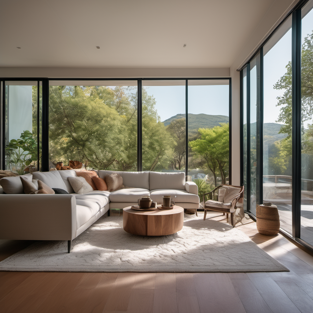
Picking interior paint colors for a New England colonial is different from picking colors for a modern build. The bones of the house — the crown molding, the six-over-six windows, the plaster walls, the wide-plank pine floors — are already speaking. Your job as a homeowner is to choose colors that let the architecture keep talking, not paint over it. After 15 years of painting colonials across Needham, Wellesley, Dover, and the rest of MetroWest, here's how we think about it.
Why Colonials Need Different Colors Than New Builds
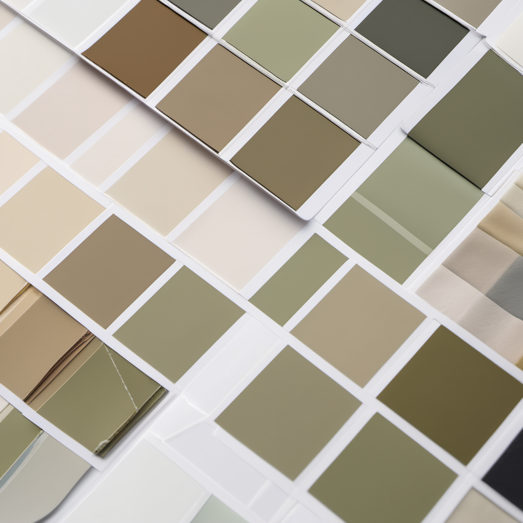
Colonial homes — Federal, Georgian, Cape, Greek Revival, Colonial Revival — were built around color palettes that reflected what was actually available: iron oxide reds, indigo blues, yellow ochres, lime-based whites, and the muted greens of verdigris and copper oxide. Those pigments have a depth and slight muddiness that modern high-chroma paints don't have. If you put a pure, bright, 2020s accent color next to 200-year-old trim, the trim starts to look dingy instead of warm.
The reverse is also true: the clean whites and grays that look fantastic in a new open-plan build can make a low-ceiling colonial feel clinical. The rooms are smaller, the ceilings are lower, the natural light comes through fewer windows — and crisp cool whites read as cold in that environment.
The fix is not to avoid modern colors. It's to choose them with the house in mind.
The Four Palettes That Work in MetroWest Colonials
1. Warm, Historic Whites
A warm off-white is the workhorse of a New England colonial interior. It reads as clean and timeless in rooms with plaster walls, original trim, and period molding. The key word is warm — whites with a yellow, cream, or soft greige undertone, not the blue-based pure whites that dominate Instagram.
Benjamin Moore's Historical Color Collection is a good starting point — 174 colors curated specifically for period architecture. We see homeowners land on warm whites like BM Simply White, BM White Dove, BM Linen White, or the slightly deeper BM Muslin for high-light rooms that need a touch more body.
2. Deep, Muted Blues
Navy and muted teal are classics in colonial libraries, dining rooms, and powder rooms. They're the direct descendants of historic indigo — rich, saturated, and easy to live with because they don't compete with natural wood tones. A navy like BM Hale Navy or a softer BM Newburyport Blue in a small room creates depth without feeling heavy.
The trick: pair deep blues with warm whites on trim, not bright whites. Cool blue against cool white reads as sterile. Cool blue against warm white reads as traditional.
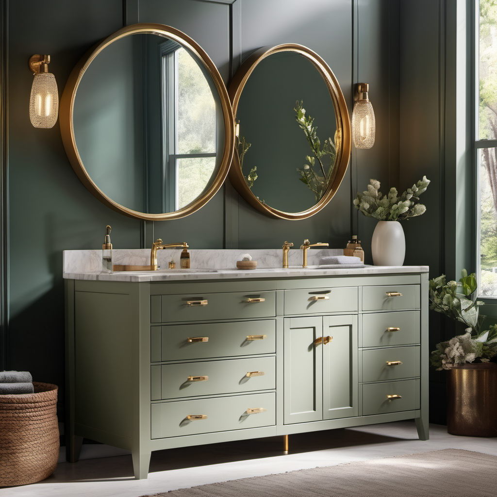
3. Sage and Earth Greens
Muted greens — sage, celadon, eucalyptus, and the deeper BM Essex Green — have a direct line back to verdigris and natural pigment greens used in colonial interiors. They work beautifully in kitchens, mudrooms, and small bathrooms because they echo the outdoors that your colonial is almost certainly surrounded by in MetroWest.
If you have original wood floors with a warm honey tone, a sage wall behind them turns into something close to magic. If you have newer oak or a whitewashed floor, deeper greens hold their own better than pale sages, which can disappear against bleached wood.
4. Soft Greiges and Warm Grays
Not every room wants a statement color. For bedrooms, hallways, and transitional spaces, a warm greige gives you a neutral that plays well with antique wood, modern furniture, and everything in between. BM Edgecomb Gray, Revere Pewter, and Pale Oak are the three we see most often in MetroWest colonials, and they all lean warm enough to keep a plaster-walled room from feeling cold.
We've written more about choosing whites specifically in our guide to the best white paints for dark New England rooms — it's a related question that comes up a lot in low-light colonial rooms.
How to Pick Colors Without Painting the Whole House Twice
A few practical steps that save homeowners the most painful version of the color-selection experience — picking something on a screen, loving it, hating it once it's on 400 square feet of wall, and starting over:
- Start with a fan deck, not a phone screen. Swatch apps and website color tools are unreliable — they render differently on every screen. A physical fan deck from Benjamin Moore or Sherwin-Williams costs little and pays for itself on the first project.
- Test at least three samples per room. Paint 2-foot-by-2-foot patches on the wall — not on foam board — and leave them for at least 48 hours. You need to see the color at morning light, midday, lamp light, and evening light. Colonial rooms especially look very different across the day.
- Test against your trim. Paint samples next to whatever trim paint will stay. Undertone mismatch between wall and trim is the single most common regret we see.
- Consider the ceiling. In a lower-ceiling colonial, a slightly warmer off-white on the ceiling (not stark builder-grade flat white) makes the room feel lighter, not shorter. Counter-intuitive but consistently true.
- Match sheen to the period. Flat on walls, eggshell in kitchens and baths, and a satin or semi-gloss on trim and doors is traditional and practical. Our finish guide by room covers this in more detail.
Colors We Usually Steer Homeowners Away From
Not a list of forbidden choices — just colors we've seen homeowners regret in colonial interiors:
- Pure cool whites (anything with blue or gray undertone in a warm-light colonial room) — they turn on you at sunset
- High-chroma accent walls in low-light rooms — they visually shrink an already-small colonial room
- Trending gray-on-gray palettes in homes with honey-toned original wood — the gray drains the warmth out of the wood
- Ultra-saturated greens or blues on all four walls of a small bedroom — accent walls or wainscoting-height color stops usually wear better long-term
None of these are wrong everywhere. They're just easy to get wrong in a colonial, and expensive to fix once the whole room is done.
Frequently Asked Questions
What color white is best for a colonial home interior?
Warm, slightly off whites — Benjamin Moore Simply White, White Dove, Linen White, or Swiss Coffee — are reliable in colonial interiors. They complement original trim and wood floors without the sterile effect of pure cool whites. Always test a sample at multiple times of day.
Can I use modern paint colors in an older colonial?
Yes — modern colors work when the undertones match the house. Muted, earthy versions of current trends (sage instead of electric green, soft navy instead of cobalt, warm greige instead of cool gray) respect the architecture. High-chroma trendy colors usually fight with period details.
Should the ceiling be white in a colonial home?
Not necessarily pure white. A slightly warm off-white — or even the same wall color at 50 percent strength — often looks better than builder-grade flat ceiling white in a colonial, especially in rooms with lower ceilings. It makes the room feel taller, not shorter.
How many colors should a whole-home colonial interior use?
Most colonials read best with a consistent trim color throughout, one or two wall neutrals, and two to three accent colors in specific rooms (dining room, library, powder room). Continuous color in open-flow spaces, statement colors in enclosed rooms.
Do I need a designer to pick paint colors?
For most projects, no. A physical fan deck, real paint samples, and patience through a couple of test days are usually enough. For whole-home color plans or high-stakes rooms, a color consultant is money well spent — we can recommend several who work in MetroWest.
When You're Ready to Paint
We'd rather you pick colors you love on the first try than paint a room twice. If you want a second opinion on a palette you're considering — or you're looking at your dining room for the fifth time this month and want someone to help you stop second-guessing — give us a call at (774) 217-9567. We'll walk the space, look at your trim and your light, and help you think through it. No pressure to book, and no sales pitch on colors you're not sure about.
Related Reading
David Griffiths