TL;DR: In dark New England rooms, skip cool, bright whites like Chantilly Lace or Extra White — they look gray and flat. Go with warm-undertone whites in the LRV 82–90 range. Benjamin Moore Simply White, White Dove, or Sherwin-Williams Alabaster are the safest picks for north-facing and low-light rooms.
White seems like the easiest paint decision. Pick white, done. Except if you've ever painted a dark room white and had it look gray, dingy, or weirdly blue — you already know it's not that simple.
In 15 years of painting homes across MetroWest Boston, this is one of the most common problems we help homeowners solve. The short version: not all whites are the same, and the ones that look bright on a paint chip can look terrible in a room that doesn't get much light.
Here's how to pick the right white for your specific room.
Why White Paint Looks Wrong in Dark Rooms
Every white paint has a Light Reflectance Value (LRV) — a scale from 0 (pure black) to 100 (pure white) that measures how much light a surface bounces back. Higher LRV means more reflected light. In a bright, south-facing room, almost any white works because there's plenty of light to reflect.
In a dark room, two things happen:
- Shadows get amplified. Corners, ceiling lines, and the spaces between furniture all read darker. A very bright white makes these shadows more obvious, not less — the contrast between the white surface and the shadow is too harsh.
- Undertones come out. Every white has an undertone — yellow, blue, gray, green, pink. In good light, you barely notice. In low light, that undertone becomes the dominant color your eye picks up. A white with blue undertones reads icy gray. A white with too much yellow reads dingy cream.
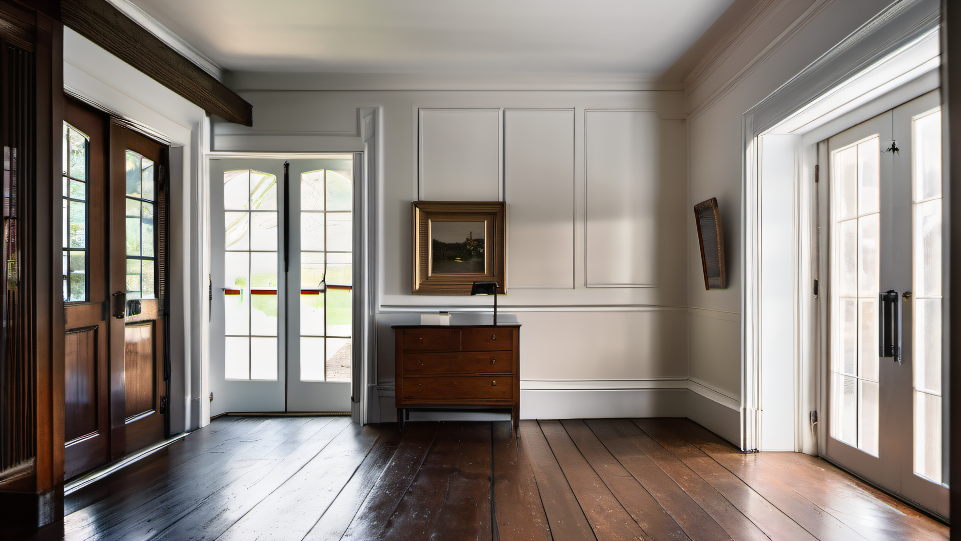
North-Facing Rooms: The New England Problem
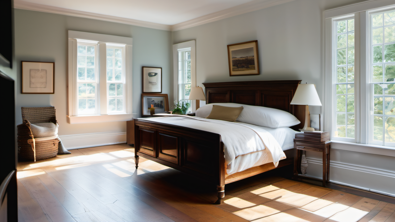
New England homes — especially the colonials and capes in Medway, Wellesley, and Natick — have a lot of north-facing rooms with smaller windows. That means cool, indirect light with a blue-gray cast for most of the day.
Cool light pulls out cool undertones. A white paint that looked clean and crisp on the store sample becomes flat, gray, and cold on your north-facing bedroom wall. The fix is simple: choose whites with warm undertones (yellow, cream) to counterbalance the cool light.
Our Go-To Whites for Dark Rooms
We use Benjamin Moore and Sherwin-Williams almost exclusively. Here are the whites we reach for most often in low-light situations, with their LRV values and undertones:
Benjamin Moore
| Color | LRV | Undertone | Best For |
|---|---|---|---|
| Simply White OC-117 | 89.5 | Warm yellow | Dark rooms that need to feel bright and clean without being stark |
| White Dove OC-17 | 85.4 | Soft yellow/gray | A softer warmth — BM's most popular white for a reason |
| Cloud White OC-130 | 87.4 | Cream | Rooms that need warmth but not too much yellow |
| Swiss Coffee OC-45 | 84 | Muted yellow | When you want barely-off-white without going cold |
Sherwin-Williams
| Color | LRV | Undertone | Best For |
|---|---|---|---|
| Alabaster SW 7008 | 82 | Yellow/greige | Top pick for dark rooms — reads warm and rich without being yellow |
| Greek Villa SW 7551 | 84 | Soft yellow | Cleaner than Alabaster, less gray — good for slightly more light |
Whites to Avoid in Dark Rooms
| Color | LRV | Why It Fails |
|---|---|---|
| Chantilly Lace OC-65 | 92.2 | True neutral white — shows every shadow, reads gray in low light |
| Extra White SW 7006 | 86 | Blue/cool undertone — goes icy and flat in north-facing rooms |
The common pattern: whites with LRV above 90 are too bright for dark rooms (counterintuitive, but true), and whites with cool undertones make the problem worse. The sweet spot is warm whites in the 82–90 range.
How to Test Before You Commit
Paint chips lie. The sample you see under fluorescent store lighting has nothing to do with how that color looks in your north-facing living room at 4 PM in February. Here's how we tell clients to test:
- Get sample quarts, not chips. Paint a 2-foot square on the actual wall — both a section that gets light and a section in shadow.
- Look at it at different times of day. Morning light, afternoon light, and evening with lamps on. The color shifts significantly in each condition.
- Test on at least two walls. The wall facing the window and the wall opposite will look like different colors with the same paint.
- Wait 24 hours. Paint dries lighter than it goes on. What looks perfect wet may look washed out once it cures.
If you're stuck between two options, we're happy to look at your room and give a recommendation. We've painted enough homes across Holliston, Dover, and Framingham to know what works in these specific lighting conditions.
For more on choosing finishes to pair with your white, see our guide on choosing the right paint finish for every room. And if you're also thinking about accent colors, our post on interior paint colors that increase home value covers what pairs well with warm whites.
Frequently Asked Questions
What is the best white paint for a room with no natural light?
Benjamin Moore Simply White (LRV 89.5) or Sherwin-Williams Alabaster (LRV 82) are the most reliable choices. Both have warm undertones that prevent the gray, washed-out look you get from cooler whites in rooms without natural light.
Why does my white paint look gray?
Your white has cool undertones (blue or gray) that are being amplified by low or indirect light. North-facing rooms and rooms with small windows make this worse. Switching to a warm-undertone white in the LRV 82–90 range solves this in most cases.
Does paint sheen affect how white looks in a dark room?
Yes. Higher sheens (satin, semi-gloss) reflect more light and can make a room feel slightly brighter. Flat or matte finishes absorb light, which makes dark rooms feel darker. For dark rooms, we recommend eggshell or satin on walls.
Should I use the same white throughout my whole house?
Not necessarily. A white that looks warm and inviting in a north-facing bedroom might look yellow in a south-facing kitchen flooded with sunlight. We often use two or three related whites in the same home, chosen for the specific light each room gets.
If you're wrestling with white paint decisions and want a second opinion, give us a call at (774) 217-9567. We'll come take a look at your lighting and point you in the right direction — no charge, no commitment.
Related Reading
David Griffiths